In today’s digital world, people often start online when looking for something—especially those looking to give back or connect with a nonprofit. They want to see proof of your efforts and why they should choose you to partner with.
This means your site lays the foundation for your nonprofit’s online presence. It’s often the first point of contact between an organization and its potential donors, making it an essential place to leave an excellent first impression.
Sound like a lot of pressure? It can feel like it when you’re DIYing your site. Fortunately, the StoryBrand framework can help you build a high-performing nonprofit website.
But before diving into that, we must acknowledge the truth about building websites: many people do so backward.
Typically, website development focuses heavily on look, feel, and aesthetics (which makes sense). Donors are attracted to a nonprofit website that looks good. Unfortunately, this often pulls marketers, development directors, designers, and developers to prioritize visually appealing layouts and then squeeze in words (what we refer to as copy) and messaging afterward.
The result? Websites that look beautiful but often don’t convert well. If you’re a nonprofit, the last thing you want is to stretch your budget on a website that doesn’t actually grow your mission.
As with most things, building something backward is less than ideal. Your approach should prioritize substance and style, placing strategic messaging at the forefront of your website. Enter the StoryBrand framework, a powerful tool we use that has revolutionized how nonprofits approach storytelling and communication.
Developed by Donald Miller, the StoryBrand framework is based on the fundamental principles of storytelling—specifically, the idea that every nonprofit organization should be the guide in its donor’s journey. By understanding the supporter’s pain points, offering a clear solution, and providing a call to action, nonprofits can create compelling narratives that resonate with their target audience.
At its core, the StoryBrand framework emphasizes the importance of clarity and simplicity in communication. Rather than bombarding visitors with all the things at once, nonprofits are encouraged to distill their messaging into an easy-to-understand narrative that addresses the donor’s needs and guides them toward a desired outcome.
When you adopt the StoryBrand framework, your nonprofit can build a website that not only looks good, but also serves a purpose—to inform, engage, and ultimately convert visitors into donors. Rather than treating design as the starting point, the StoryBrand approach flips the process on its head, prioritizing strategy and messaging before aesthetics.
Let’s dive into how to use StoryBrand to build a high-performing website for your nonprofit. From defining strategic goals to crafting compelling copy, we’ll uncover the steps needed to create a website that effectively communicates your brand story.
A Flawed Approach: Starting With Design
As we’ve covered, in the traditional approach to website building, design often comes first. Developers dive headfirst into creating visually stunning layouts to catch the visitor’s eye and leave a memorable impression. The emphasis is on creating a website that looks good—which isn’t a bad thing.
However, an over-emphasis on aesthetics first has some major drawbacks. When design is prioritized over strategy and messaging, the result is often a website with disjointed messaging and a lack of clarity.
Unclear Messaging
Starting with design can lead to a situation where the visual elements of your website are crafted without a clear understanding of your nonprofit’s objectives. As a result, your design may not effectively communicate your nonprofit’s story. Visitors may be left confused about what your nonprofit does and what action they should take next. Without a cohesive narrative guiding them through your website, they’re more likely to bounce.
Lack of Clarity
Without a solid messaging foundation, your website can become cluttered, making it challenging for visitors to find the information they want. Important details may get lost amidst the visual noise, leading to frustration and a negative user experience. When visitors can’t quickly understand how your nonprofit makes a difference, they’re unlikely to stick around for the long haul.
Decreased Conversions
The most significant consequence of prioritizing design over messaging is the missed opportunities for engagement and conversion. A beautiful website may capture attention initially, but if it fails to compel visitors to take action, it’s ineffective. Without a solid call to action and a clear path forward, visitors wander aimlessly (which never ends well for your bottom line!).
This flawed approach is like constructing a house without a solid foundation—a stunning outside might be impressive at first glance, but without structural integrity, the house will eventually crumble.
Fortunately, there is a better way. By flipping the traditional approach on its head and prioritizing strategy and messaging before design, your nonprofit business can build a website that gets the job done.
The Solution: Switching up the Process
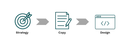
Instead of design then copy, the best website development process looks like this:
- Start with strategy and develop your messaging (use your BrandScript here!).
- Then, write your compelling copy.
- Then, design a layout that can accommodate said copy and cohesively move people through your brand story.

Strategy First: Defining Your Goals, Audience, and Brand Positioning
Before diving into design or content creation, it’s essential to establish a solid strategic foundation. This means defining clear goals for your website, understanding your target audience, and positioning your nonprofit effectively within the market. Here’s what you can do:
- Define Your Goals: What do you want your website to achieve? Whether generating donations or increasing brand awareness, clearly defining your objectives will guide the rest of the website-building process.
- Understand Your Audience: Who are you trying to reach with your website? Understanding your target audience’s demographics, preferences, and pain points is crucial for tailoring your messaging and design.
- Position Your Nonprofit: How do you want your audience to perceive your nonprofit? Establishing a clear identity will help ensure consistency across your entire website.
Using the StoryBrand Framework to Craft a Compelling Message
With your strategy in place, your next step is to craft compelling messaging that resonates with your target audience. This is where the StoryBrand framework comes into play.
By following the StoryBrand framework, your nonprofit can ensure its messaging is clear, concise, and focused on addressing the needs of its target audience. Remember: With StoryBrand, it’s not about you—it’s always about how you serve your audience. Whether it’s your homepage headline, service descriptions, or calls to action, every element of your website should contribute to telling your nonprofit’s story and guiding visitors toward conversion.
Improving Your Copy
Effective copywriting goes beyond simply describing products or services—it captures your audience’s attention, evokes emotion, and encourages action. Remember these things when writing your copy:
- Clear and Concise: Good copywriting is clear, concise, and easy to understand. It clearly communicates your value proposition and addresses your audience’s pain points.
- Evoking Emotion: Emotion is a powerful motivator, and effective copywriting taps into the audience’s emotions to create a connection. Whether through storytelling, testimonials, or persuasive language, emotionally focused copy can drive engagement and conversion.
- Compelling Calls to Action: Every piece of copy on your website should have a clear call to action. Whether signing up for a newsletter, making a donation, or scheduling a consultation, the call to action should point users exactly where you want them to go.
Prioritizing strategy before design will help your nonprofit better understand its goals and how to ensure your website visitors take action.
Next, Design
You understand the importance of writing donor-focused copy by now, but we’re not kicking design to the curb, either! Design is pivotal in shaping the user experience and reinforcing your nonprofit’s message. However, effective design goes beyond aesthetics—it’s about creating a visually appealing website that captivates visitors, guides them through their journey, and encourages action.
Combining Design With Your Brand Story
In addition to aligning with strategy and messaging, design elements should also complement your brand story. Here’s how to ensure your design elements are effective:
- Visual Identity: Your nonprofit’s visual identity should reflect your personality and values, including colors, fonts, and imagery. Incorporate these elements into your website design to create a cohesive brand experience that resonates with your audience.
- Consistency Across Touchpoints: Consistency is key to building brand recognition and trust. Design elements should be consistent across all touchpoints, from the website to social media to offline marketing materials.
- Accessibility and Usability: Your design should prioritize accessibility and usability, ensuring visitors can easily navigate the website and access its content. This includes straightforward navigation, legible typography, and responsive design for optimal viewing on all devices.
Designing with purpose is essential for building a high-performing website that effectively drives results for your nonprofit. Interested in seeing 45+ nonprofit websites that were optimized with StoryBrand? In addition to our strategic fundraising planning, I also run a marketing firm, and pulled together this list of StoryBrand websites here.
StoryBrand can transform websites from digital storefronts into immersive storytelling experiences. By prioritizing strategy, messaging, copywriting, and design, your nonprofit can feel confident that its website serves a purpose—ultimately converting visitors to donors.


